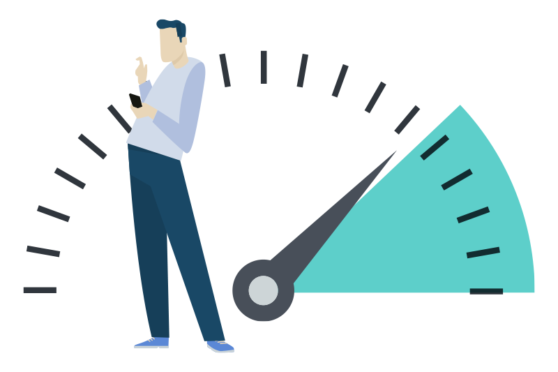
Page loading time is very important for the user experience. A beautiful website has no value if no one can see it. Put yourself through the experience of having to wait for a website that never loads. 40% of visitors abandon a website that takes more than 3 seconds to load.
If those above are not enough reasons to optimize your speed, then consider the following benefits of having a fast website:
Higher ranking pages
More traffic to your site
Enhanced user experience
Higher conversion rates
Page loading time
Why Choose Us To Optimize Your Site?
We have both the experience and reputation. We have optimized hundreds of sites over several years and worked for some of the most reputable names in the medical industry.
But that’s not all – we will test your website using Google’s own speed test. We will gather all the necessary information and follow Google recommendations. Once fixed, you will be able to test the website for yourself.
Wow thanks! That looks like a pretty dramatic improvement!
John Paul Gallardo, DDS PA
Plastic Surgery Is A Big Decision
It’s important to understand something else, to: getting plastic surgery is an important life decision, a research-driven decision with a lot of money at stake. Patients don’t take the decision lightly. In fact, more and more are turning to the web every day to ask questions, research doctors, and learn Instead, they often take their time, visit multiple websites, and conduct their research over many weeks, months, or even years. And they do so across multiple devices. So they may be researching a procedure on their desktop at the office one day, but looking for a specific physician on their phone another day. And somewhere in between perhaps they are browsing their tablet to see what choices they have.
more and more are turning to the web every day to ask questions
Medical marketing in mobile devices
Medical Marketing Strategies Must Cater To Prospective Patients Across Devices
The point is that you need to cater to your audience across these devices and platforms. One of the biggest tools in your arsenal is the use of responsive design for your website. With responsive design you specifically target different devices and platforms with the optimal experience for each. That means someone on a desktop sees just the right layout for their needs, while someone browsing from a phone has a more streamlined and fast-loading experience, and yet someone else on a tablet has an experience unique to their needs.
Responsive Designs Provides Optimal Content To Every Prospective Patient Visitor
Responsive design is one tool in a toolbox of many for mobile optimization. You must develop a fast and efficient website, and make it more app-like. Remember, you don’t have a person using a mouse and keyboard browsing the site, so think of a scaled-back version, one where the most important information is right at their fingertips and they can get what they need with a simple click of a button or swipe of a finger. Consider that your next patient may be on the go, in the car, on the subway, even walking down the street. The experience is fundamentally different.
Responsive web design. Different devices
Mobile marketing in multiple devices
Mobile Optimizations Is Rewarded With Better Rankings
This obsession over mobile optimization results in extremely high scores across the board for our clients using Google’s own speed testing tools. Regularly we see competitor’s clients scoring 40s and 50s. We average 95 and even have some sites scoring flat-out 100. That is almost unheard of. But it gives you the edge over your competitors because Google is obsessed with mobile as they see the coming wave of mobile utilization and a shift in the advertising spend associated with it.
So ignore mobile at your own peril. Instead, pursue a mobile-first strategy where your site operates like it was created by Apple and each and every page is laid out perfectly and lightning fast.
Our Happy Clients
miamiperio.com
therhinoplastycenter.com
leaplasticsurgery.com
Frequently Asked Questions
Frequently asked questions regarding the Speed Optimization
What are the risks of speed optimization?
Absolutely none. We will create a backup of your website to rollback to a previous version in case anything goes wrong. Your website’s design will remain exactly the same. We will work on your website by stages and your website will stay functional all the time.
How long it takes to optimize the speed of my website?
3 days. It usually takes one day to create a backup and prepare the site, one day to optimize and another day for quality assurance. We will notify you in case it takes longer.
Will the speed optimization results last?
Yes. We will monitor your website for 1 month. Be aware that the results won’t last forever. Every change you make to your pages can affect your speed performance if you don’t follow Google guidelines to make the web faster.
Why is speed optimization important?
A fast website will offer better user experience and, as a result, will have a better chance of converting. Slow websites usually have higher bounce rates. Plus, Google uses page speed as a ranking factor.
Why choose us to optimize the speed of your site and not those other options for $49?
There are many scammers online offering optimization solutions for incredible prices. You are free to choose, but we are a real, US-based company that takes its reputation seriously.